Data Visualization - Process Book Bollé, Kuenlin et Neu
Data Visualization
Dr. Benzi
Ultimate Movie DataViz
by
Bollé Timothy
Kuenlin Quentin
Neu Virgile
Automn 2017
With this project, we propose an overview on the movie industry, more specifically by looking at the relations between well known movies. Usually, this is done by looking at the actors or directors they have in common, or by looking at features like budget, revenue or ranking. Here, the idea is also to point out the work of crew members that are neither actors nor directors but are present in a lot of movies, like hairdressers, CGI techniciens, sound effects directors and so on.
We will use an unique interactive visualization to integrate those different dimensions. It is addressed to anyone who want to explore the various relations and have a better understanding of the movie industry.
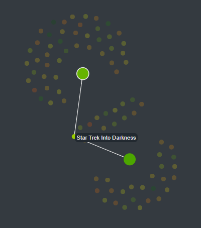
This idea came to us by looking at some visualization that show how some entities were linked in a particular universe or space. For instance, we saw network visualisation about Star Wars[1], Star Trek[2] or even Subreddits[3]. We found this pretty interesting and looked at which universe/space we could focus on. We decided to look at movies in general and not to focus in a particular universe.
We looked at various movie dataset and found one that have more informations than expected (not just actors and directors), which can be even more interesting and original. A lot of visualization and analysis of movie dataset already exist. For instance Jay Ng propose interesting interactive visualizations[4] and there are a lot like this. However, we didn’t find any visualization that show link made with the crew members. We would like to let the user explore the data by letting him go through different point of view, highlighting different feature that he could choose.
The dataset we chose contains 5000 movies extracted from The movie Database (https://www.themoviedb.org/?language=fr). It contains generic informations about the movies (title, language, production country/companies, genres, budget and revenue, and grades). For each movie, we also have complete cast and the crew.
The dataset is available here : https://www.kaggle.com/tmdb/tmdb-movie-metadata/data
To increase the interactivity and the information available in the visualization, we may want to combine data from other sources, like wikipedia or ImDB.
The data was explored using a Jupyter Notebook and Python. We started to clean the data and to integrate it into a sqlite database. The advantages of this format is that it facilitates information retrieval with simple sql queries, and that the database is a simple file that do not need to run on a particular server.
We examined the possibility to make requests directly from javascript, in a similar way we would have opened a file, but it seems complicated to do it in this particular language. In fact, a script exists to make SQL request to a sqlite file in javascript (sql.js). The first main issue was to load the sqlite file into the browser. As it is a web page, there is no possibility to load files that are not JSON, CSV or other separated data file, for security reasons. The first workaround we explored was to embedded the sqlite database into a JSON file to be able to load it, but there was problem because it is a binary file, and JSON is read as a string, so some reserved characters broke the JSON. Even using a base64 encoding (binary to string) didn’t work, the database was broken when decoding the string. Then we managed to create a DB inside the browser, not by directly importing the sqlite file, but by recreating it with SQL commands “CREATE TABLE” and “INSERT INTO”. But after that, the second main issue arises. It was very slow. It took nearly 10 seconds to load the page, whereas with simply JSONs it took 1. And the third and last issue that made us give up this idea was the way the data was returned by queries. With JSONs we are able to do filter operation that returns us another JSON array. With SQL, the result is an array of arrays, not an array of JSON, so the selection of attributes become way harder and we have to use indices instead of name, that complicates the code.
However, we still kept a sqlite database to store the data outside of the Viz, and just extracted JSON from it in Python.
Once the data was put in the database, we had 104842 person, cast and crew mixed, 4803 movies and 235665 links between movies and people. The crew was splitted into different department and jobs. All the person from the cast were assigned in the same department and job: Cast > Actor. The problem here is that the main actors and extras/stunt doubles are in the same category, which results in a huge category that may be hard to handle later in the visualization. An idea to separate some of the person, could be to extract a list of well known actors.
As a first try, and to develop the visualization, we chose to take only movies with a popularity greater to 50 (we don’t know exactly here what it represent but it range from 875 to 0). We also removed the links and the associated person where a person was linked to only one movie. For now, we also removed the person that were under the department CREW, because it wasn’t really clear what it meant and because we want to initially focus our visualisation on the department level (and not the job level).
The next step of the project is to establish a first visualization design and experiment it.
To do this, we tried to follow the steps proposed by McKenna et al. (2014)[5], the first step (Understand) had been already done.
To resume, we want to:
The user should be able to explore the data, find interesting links and think about new aspects of movies. It could also be useful to find movies similar to one movie the user liked.
Because we want to display relations, we first thought about a classic node-link diagram.
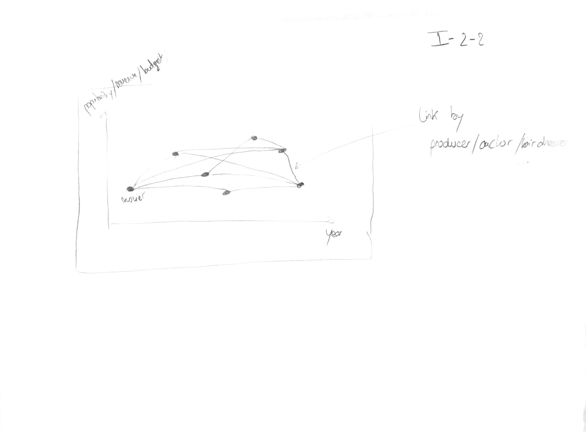
Sketch 1: First visualization idea
The idea was to display the different nodes on a two dimensional diagram where the x-axis could have been the year, and the y-axis the popularity, the revenue or the budget of the movie. Then, edges would have been drawn between nodes linked by same crew members or cast members.
However this kind of visualization would have been instinctive and quite easy to order, we fear that the potentially high number of links make the visualization hard to read and to navigate. Here a force-directed layout seems not adapted because it’s really resource consuming and does not show any useful information (principle of usefulness).
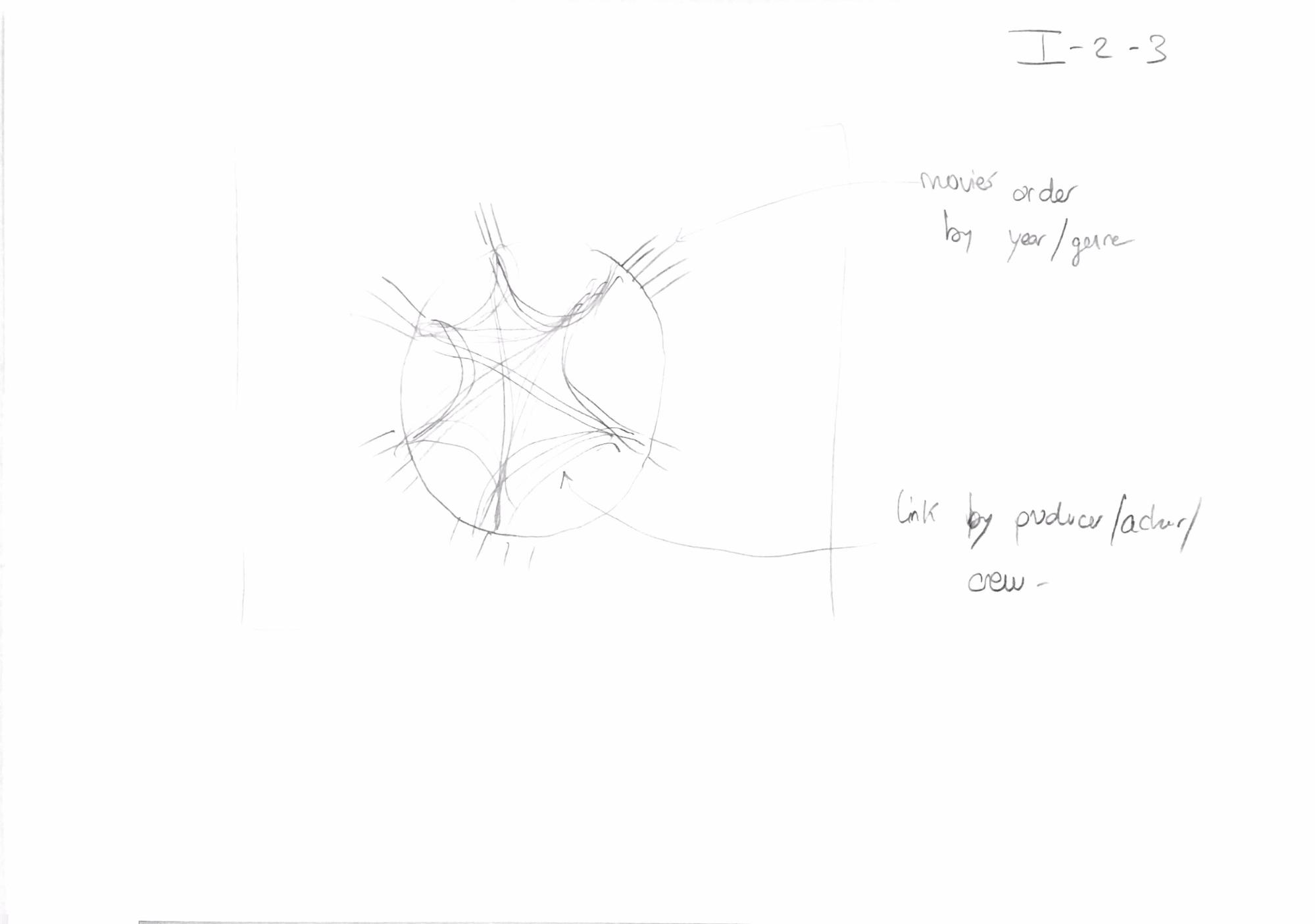
The second idea was to use circle layout with edge bundling.
Sketch 2: second visualization idea
Here, it could be possible to order the movies by year or genre (or even maybe by revenue, budget or popularity). Then, as for the first layout, the links would have been made if two movies share a crew or cast member. With this layout, the general overview is cleaner but we find this type of layout less instinctive and maybe harder to interact with, especially to zoom on some data.
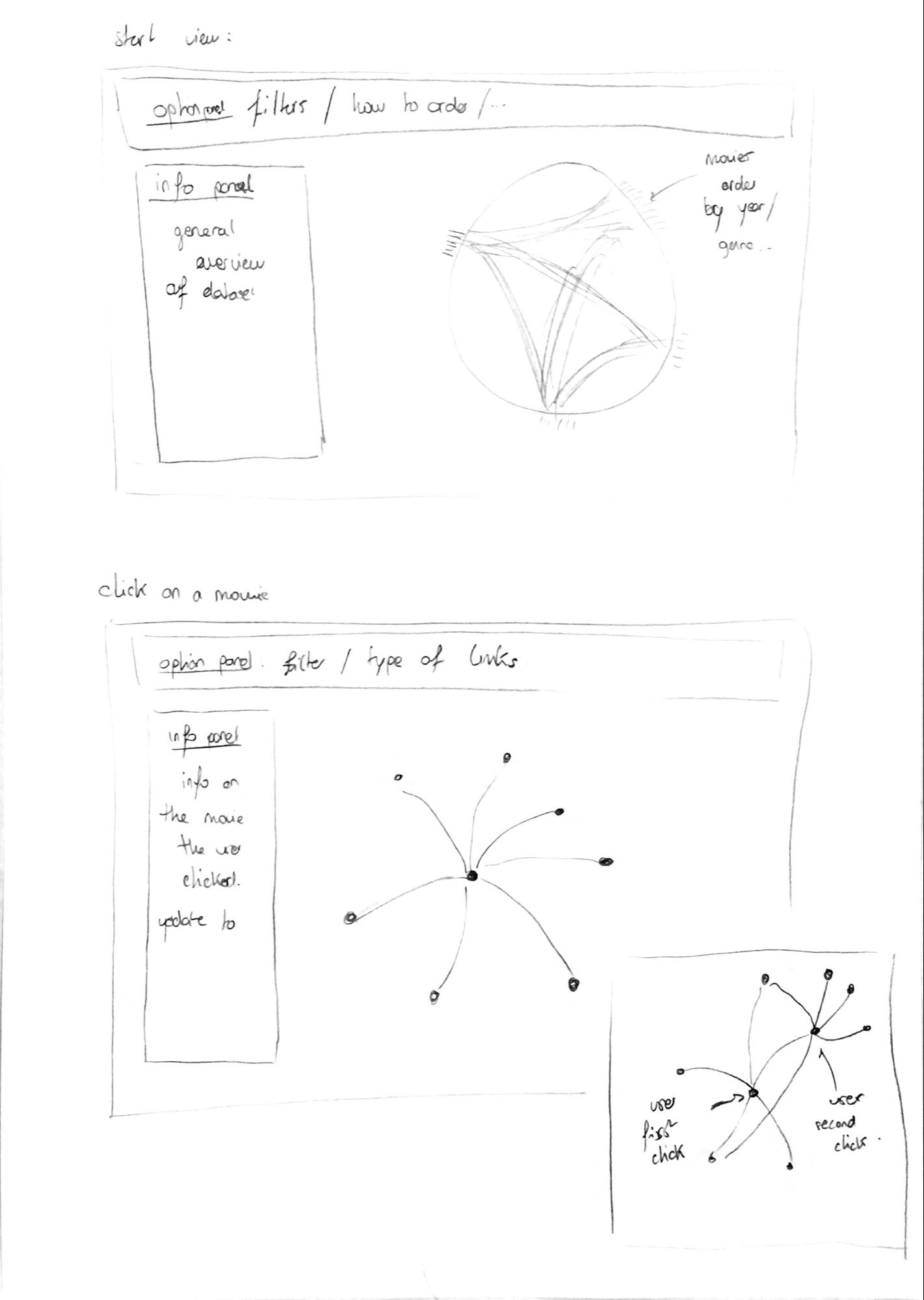
Finally, we decided to try to integrate both layout, depending of the level of detail the user want, in order to keep the benefits of both of them.
Sketch 3: Final visualization idea
To have an overview of the data, we display a circular layout with edge bundling. When a user clicks on a particular movie, we switch to traditional node-link diagram and display only the movies connected to it. If the user clicks on a second node, the movies linked to this one would be displayed. Here the layout could be a collapsible force layout or an organized layout in a two dimensional diagram, with x-axis as the year and y-axis as the popularity or revenue (scatter plot). We will try those different possibilities and see which one is more adapted.
This way, we keep the advantages of the circular layout to have an overview of the data, and the advantages of a more traditional layout, which is to be instinctive and easy to manipulate. In both views (general and detailed), we will have an option panel at the top that will allow to filter the data and select which type of link the user want to display, and an information panel where general or particular information and statistics will be displayed.
We will use points to represent movies. Movies can be splitted between different categories, like production companies, genre or year. If only one type of category is displayed, we will use the position around the circle to represent the grouping. If a second type is displayed, we will use the color of the points (following the theory on mark channels depicted by T. Munzner (2014)[6]). Concerning the links between movies, we will use lines. We may want to display the category of the link (by crew or cast, of by department or even by job) by changing the color of the link, because the position is not something we can change. Here, we will have to be careful that we do not use too many colors to show different categories. Practically, even a grouping by department will result in too many categories and thus, too many colors. To mitigate this problem, we will use a filter function in the option panel. This will not allow the user to see every categories at one time but it will be easier to read.
Here the marks and channels will be similar as before, except that we may not be able to set the position for the movies. We will then use color to display categories.
As stated earlier, we started by taking movies with a popularity above 50. This allowed us to have 452 movies to build the visualization.
The source code is available on the following GitHub repository: https://github.com/qkuenlin/DataViz. The final result can be seen at the address https://qkuenlin.github.io/DataViz/Viz/index.html.
To produce de visual elements, we used the JavaScript[7] library D3[8]. To facilitate the general manipulation of the web page and the styles, we used Bootstrap[9]. The tooltips used to guide the user through the viz were generated using Intro.js[10]. Other library were used to deal with little technical or style elements and the references can be found in the code.
The visualization is adapted to a Google Chrome browser.
As thought initially, we created the side panel and the main panel, which was composed of the filter panel and the main visualisation area.
Before going into the details of each elements, we received some comments about the general layout of the visualization.
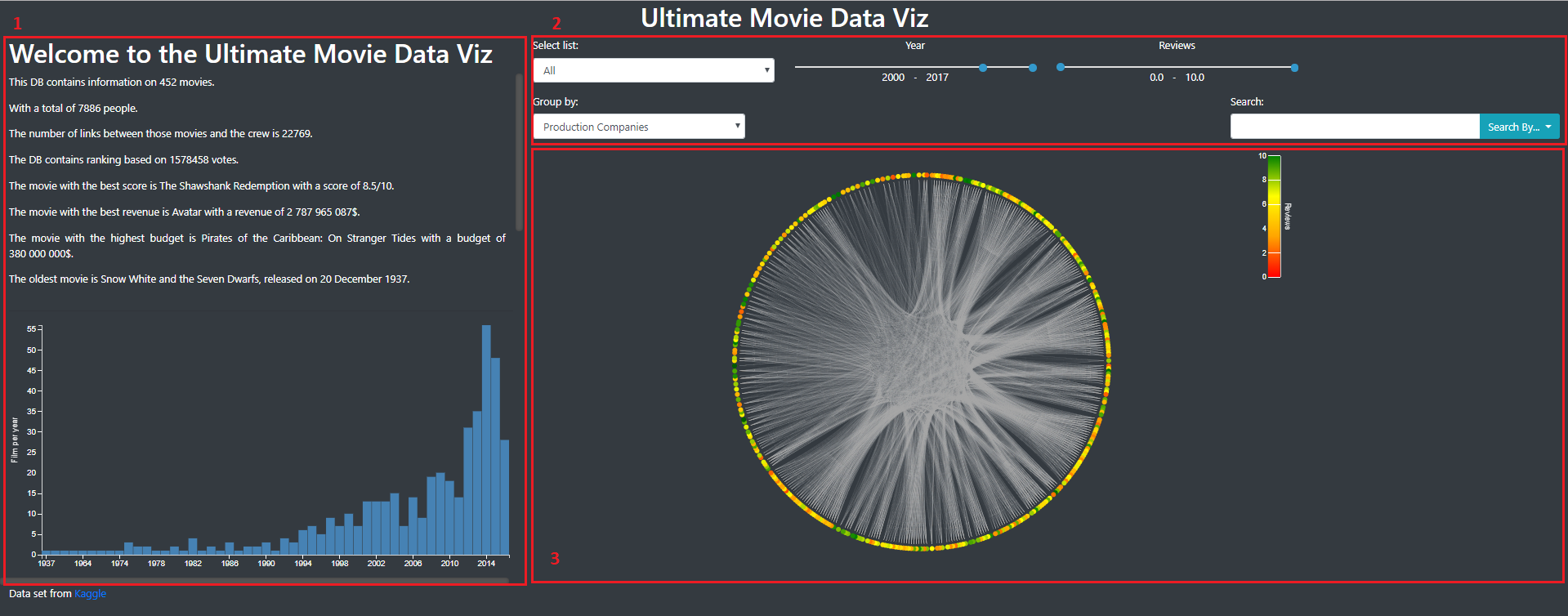
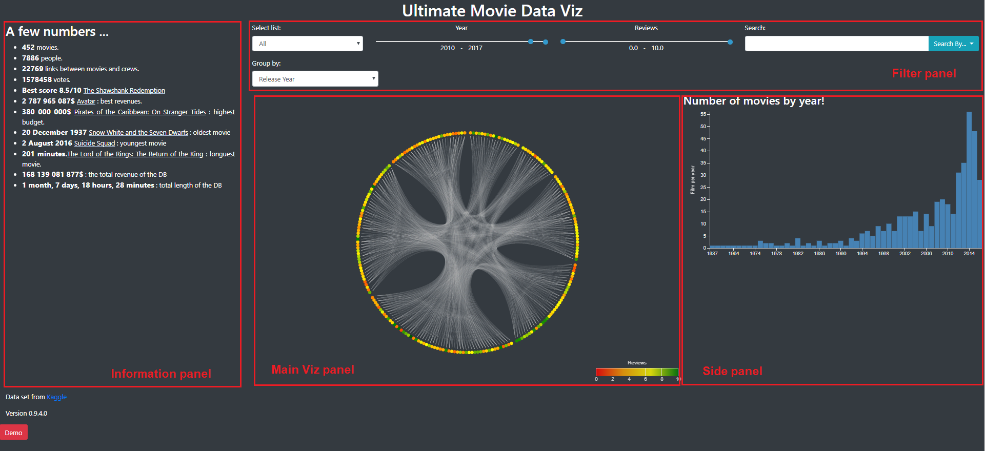
Image 1 and 2 show how those panels were placed. Image 1 was the view of some general informations about all the movies and Image was the view we obtained by selecting one movie.
Image 1: General view of the visualization. We find the side panel (number 1) that contains informations, the filter panel (number 2) that allow to filter the movies that are shown and the main panel (number 3) with the main visualization.
Image 2: Detailed view of a movie
Here we can see that there is a lot of informations on the left side of the web page and that a lot space is lost around the main visualization panel. Furthermore, it was not very convenient to have to scroll on the side panel.
In order to fix this, we decided to display informations on the left side of the web page, and to to display general barchart or details of the links on the right side. This would allow to optimize the space used on the web page (efficiency principle).
This was the final layout and visualisation we choose so we will present the general aspects of it and each features in detail.
The General view of the visualization (Image 3) present the data in a general manner. As said before, on the left, the information panel contains general informations on the dataset. Some movie titles can be clicked here to jump directly to a detailed view of these movies. In the filter panel, we already filter the year (2010-2017) because we don’t want too many movies directly on the first sight (for performance and perception issues). As we can see in the barchart in the side panel, this period contains a fair amount of movies.
In the main viz panel, we could have a big circle to maximise the space used to represent informations but we had some troubles here with the size of the different panels, especially at the loading of the page.
Image 3: General View of the Viz. The different panels are tagged and explained above.
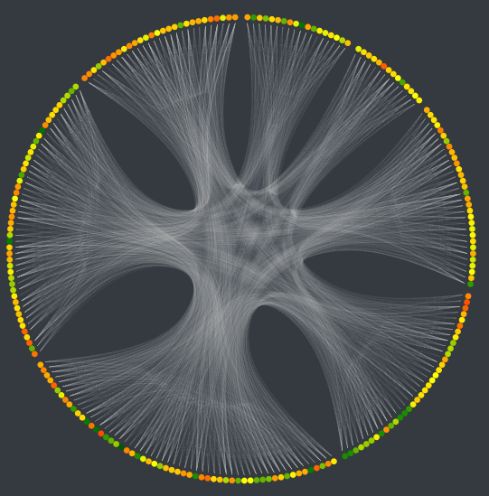
As stated earlier, in the general view, we present the different movies in a circular layout, because it allows to present more elements in a cleaner way. As shown in Image 4, each movie is represented by a point, its color representing the review of the movie, and each links between movies is represented by a white line. If two movies are linked in different manners (same director and same actor for instance), we only draw one link. Here, it could have been interesting to represent the degree of linkage, by changing the saturation of the link or its width. For example, if two movie have a lot of links between them, we draw a whiter line. However, because we have a lot of links, this would have slowed down the visualization and complicated the understanding.
Image 4: circular layout. Here, the movies are grouped by year
The grouping of the movies around the circle can be changed in the filter panel. By default, we group the movies according to their released year. Here we didn’t succeed to display the name of the categories which is quite problematic to fully understand the visualization. Other filters allow you to select the type of link you want to display, the year and the review range you want to display.
Initially, the visualization was very slow. We only had one javascript file that we split in multiple files and it enhanced the speed of the viz.
We realize that this visualization does not present a lot of informations because there is no clear patterns: everything is linked with everything. However, it’s beautiful and allow to present all the movies in one view. Here, maybe a word cloud could have been a nice visualization (with the color proportional to the review and the size proportional to the number of link for instance). Because we had the idea very late, we didn’t try it. We could expect that if too many movies had been displayed, it would have been unreadable.
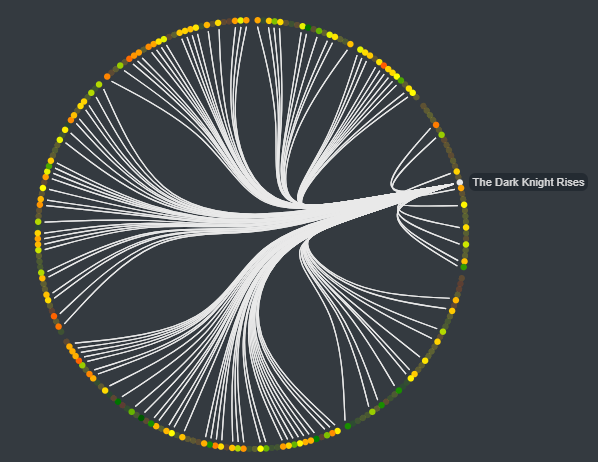
As you can see in image 5, when the mouse is placed over a node, it highlights the movies linked to it and display its title in a tooltip.
Image 5: Circular layout when the mouse is over a node.
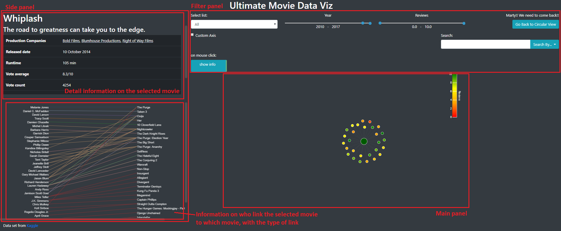
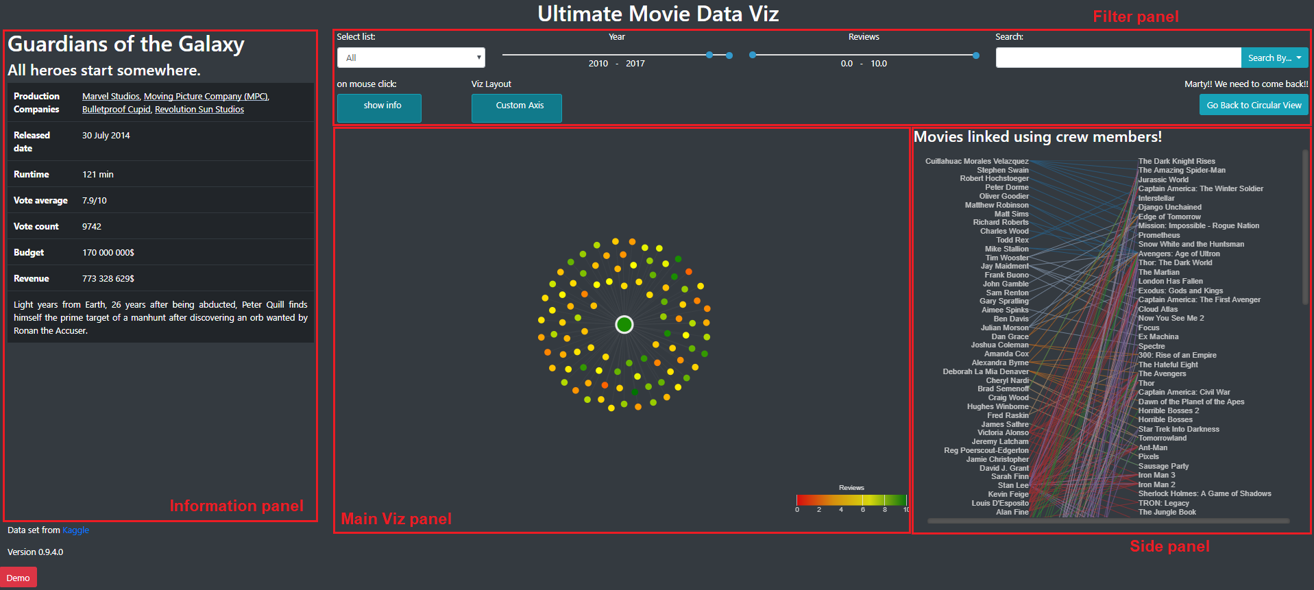
By clicking on the movie, you arrive in the detail view for this movie.
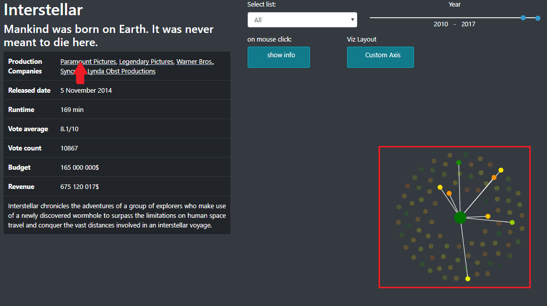
The general layout of this view is presented on image 6. The information panel contains detailed information on the selected movie. The side panel contains the list of the person that participated to this and shows with which movie this person make a link. The main viz panel contains the node-link diagram with a force layout.
Image 6: Detailed view of a movie
This visualization is interesting to represent relations between multiple movies. Here with one movie it does not provide more information than the one we had in the circular layout but here, only the related movies are present and they are no longer on the circle. It become more interesting when multiple movies are selected. Indeed, it is possible to see groups of movies that share common features. As stated before, another advantage of this visualization is that it’s quite easy and instinctive to use to navigate through the data.
Selected movies are big nodes and the movies linked to it are the little ones. To select a new movie, you can just click on a node. Passing the mouse over a node highlights the movies linked to it and display its name on a tooltip. Those features can be seen in image 7. When a lot of movies are selected (or if we had several unlinked networks), the force layout tend to push nodes outside the panel. To avoid this, borders are solid and movies cannot get out of the panel.
Image 7: Multiple movie selected and mouse over a node.
In the information panel, you see the informations on the last movie you selected. By clicking on another movie, you will display its information. To unselect a movie, you can switch the button “on mouse click: show info” to “on mouse click: close node” and then click on a selected node (Image 8). The information on the first movie you selected will appear.
Image 8: Button Show Info/ Close node
By putting your mouse over production company, you can also see which movies have the same one (Image 9). Clicking on it will select those movies. To remove that filter, you can click on the name of the company in the filter panel.
Image 9: Filtering by production company
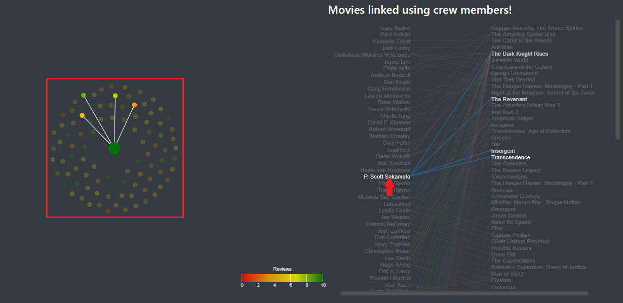
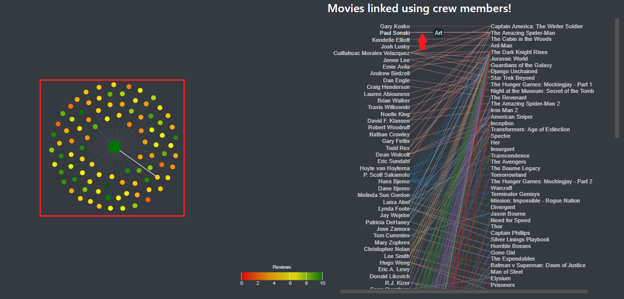
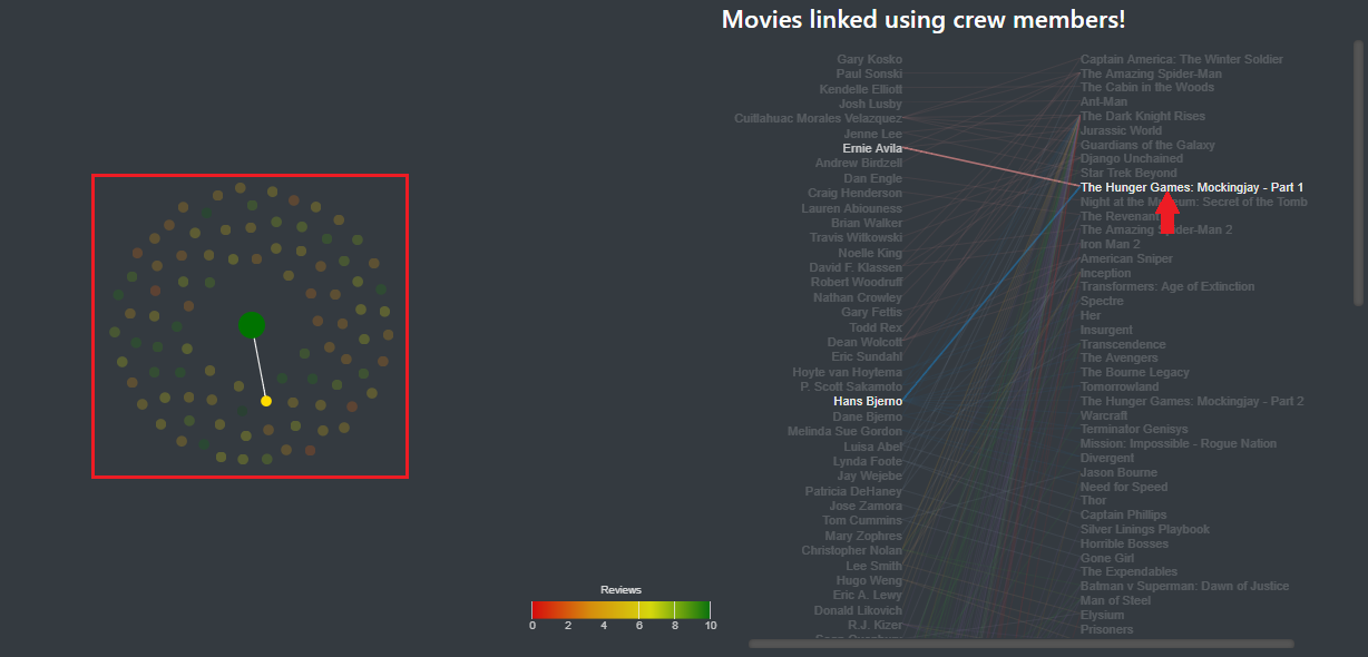
In the side panel, you can now see a visualization of each person that link the selected movie to another movie. As you can see in images 10, 11 and 12,, when the mouse is placed over a crew member, a link or a movie, the different nodes corresponding to the element selected are also highlighted.
Image 10: The mouse over a crew member highlights the movies in which he appears.
Image 11: The mouse over a link highlights the link on the main visualization along with the movies it links.
Image 12: The mouse over a movie highlights the movie in the main visualization.
If you click on the movie, it will select it. If you click on a crew member, it will select the different movie where he appears (only for the filtered movies).
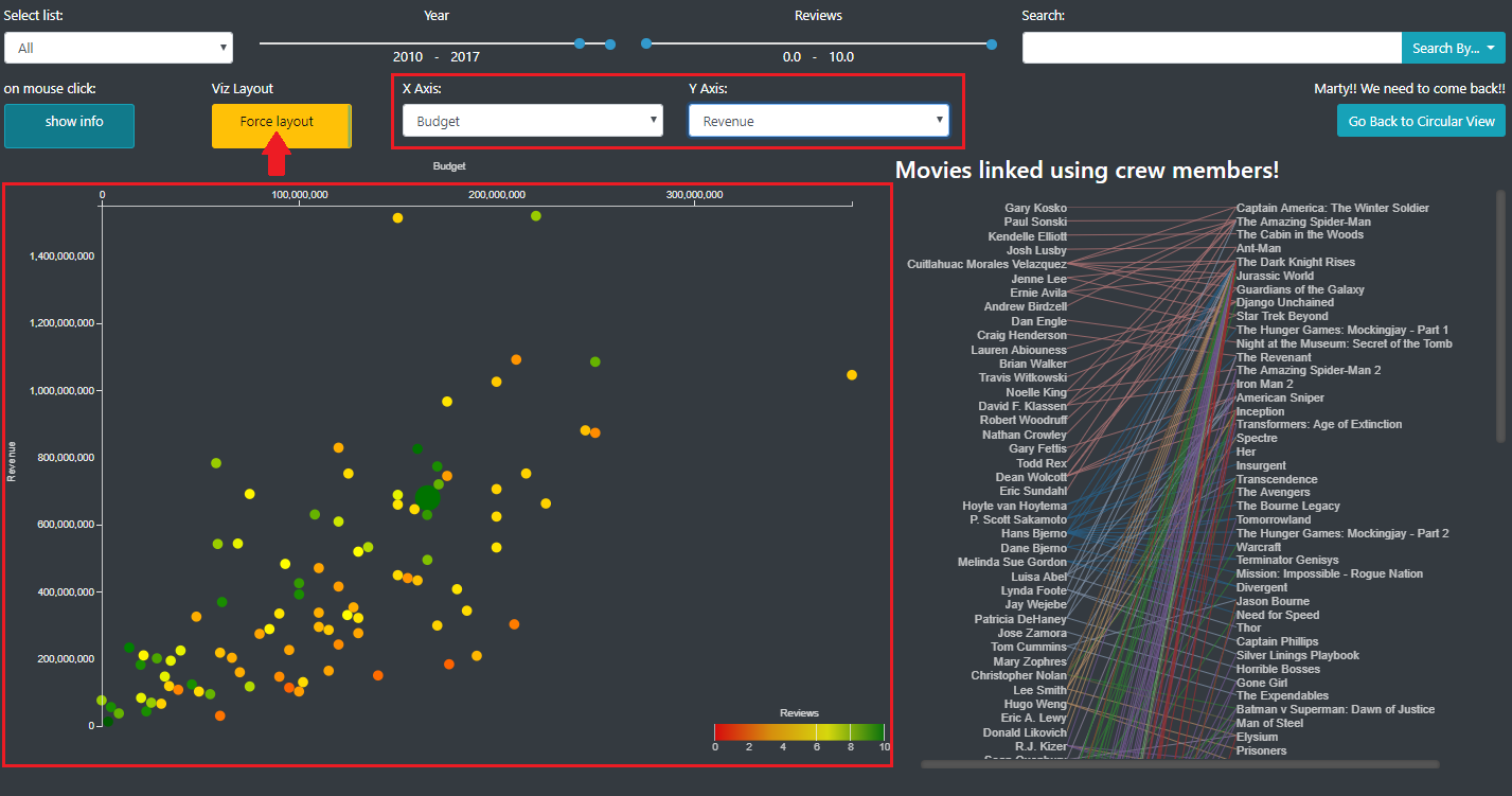
When on the detailed view, in the filter panel, you can see a button that allow you to switch to the scatter plot mode, with custom axis. In this mode, instead of having the nodes ordered by a force layout, the nodes are placed in a scatter plot along 2 axis that the user can choose (image 11).
Image 13: Nodes are ordered along 2 axis that the user can choose (Scatter plot).
In this mode, all the other features (filtering, node (un)selection...) are still available.
We thought that this visualization could be interesting to look at the features of the selected movies all at one and eventually start to look at some correlation. Here additional plug-in could be made to combine statistical calculations (mean, standard deviation, regression…) to the visual representation.
We also decided to include this feature because we realized that when a lot of movies were displayed, it was hard to navigate through the movies and to understand something. Here point should not be able to overlap even if they have the same features. However it does not respect the integrity principle, we made this choice to increase readability and the ease to use the visualization. Here, the loss of integrity is minimal and acceptable.
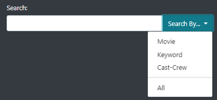
We implemented a search view that is displayed when the user use the search bar in the filter panel. As shown in the image 14, it is possible to look for a movie, a keyword, a crew/cast member, or all of them.
Image 14: Search bar functionality
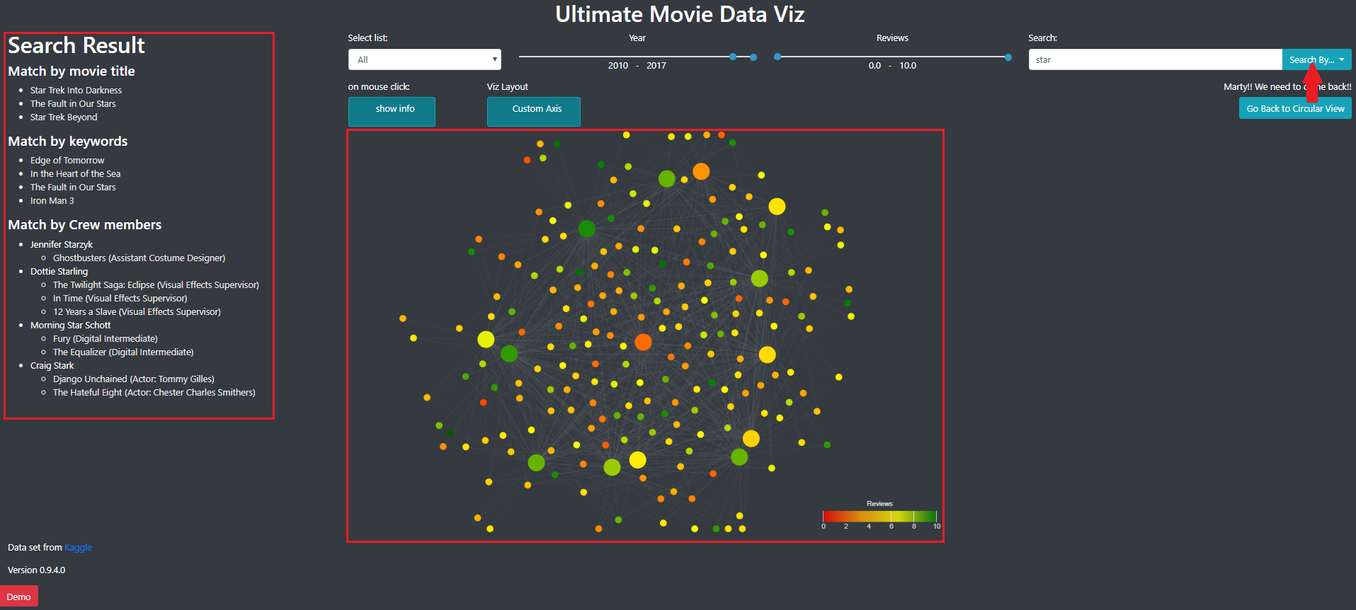
The results of a search are displayed in the information panel and in the main panel, using the node link diagram used in the detailed view (image 15).
Image 15: Result of a search.
The results are separated according to the category of search (movie, keyword or cast/crew). In the cast/crew category, we also display the role of the person in the movie and for actors, the caracter.
In the side panel of the detail view, when the user click on a person, it display the result as if this person was searched.
The Visualization was sent to various person, from different interest and age. We received the following feedback:
We also received good feedback!
The reviews were mainly made with the first attempt of the visualization. In order to address some if this problems we:
Other reviews indicated that the second attempt was better, in term of fluidity and space organization. The visualization is still almost impossible to use on other browser than Chrome. It is highly probable that some bugs are still present in the visualization. Some feedback told us that the information panel could be reduced. Also, we had trouble to size the whole page so for now it is a fixed size (the footer will probably be slightly out of the windows). We realized that it’s quite hard to have a web page adapted to any browser/screen.
However, the visualization is quite pleasant to use and, according to the feedback, interesting to browse.
The demo will be automatically started on the loading the page. We also put a demo button to start the demo again if needed.
This was made at the end of the project and some visual aspect of the helping tooltip could be improved.
The screencast presenting the visualization is available here: https://www.youtube.com/watch?v=QUfQoJuVqzw.
Everyone in the group worked well and invest a good time in the project, working on every aspect of the project.
As we wanted initially, this visualization allow to have a insight and the movie industry by looking at who worked on which movies. The final visual aspect is good although some issues are still present.
Compared to what we wanted to do initially, we managed to represent only a subset of the 5000 movies we had in the database. We think that it’s not realistic to load this quantity of movies locally and a server should be used to manage filtering request in real time.
Furthermore, we did not aggregate data from other sources and did not apply similarity algorithms to have a better insight of the data. The reason for this was the lack of time but once some features are extracted or calculated, it would be quite easy to integrate it to the actual visualization.
At the end, all the person to whom we sent the visualization managed to understand how to use it and how to understand it. When we asked what they learned with this viz, they told us it was interesting to see how, in the end, some people work on well known movies. Some cinema lover recognized crew members that are less known and discovered that it was also present in other movies. Some keyword search also started debate about why a particular movie has this keyword. We also enjoyed to look at some scatter plots, especially the budget vs. revenue one, to see how some movies succeed or not.
The design we choose, trying to respect the various principles of visualization, did not seem problematic to us and the person that tested it.
To conclude, we are satisfied of the result and may wish to improve it in the future, with more time to process the data and improve the insight the user can have on the movie industry and movie relations.
[1] http://www.kirellbenzi.com/blog/exploring-the-star-wars-expanded-universe/ (visited 21.12.17)
[2] https://datascopeanalytics.com/startrekviz/ (visited 21.12.17)
[3] http://rhiever.github.io/redditviz/ (visited 21.12.17)
[4] https://ngchwanlii.github.io/datavis/imdb-genres.html (visited 21.12.17)
[5] McKenna, S., Mazur, D., Agutter, J., & Meyer, M. (2014). Design activity framework for visualization design. IEEE Transactions on Visualization and Computer Graphics, 20(12), 2191-2200. Available at https://design-worksheets.github.io/ (visited on 21.12.17)
[6] MUNZNER, Tamara. Visualization analysis and design. CRC press, 2014.
[7] ES6 on Google Chrome
[8] v 4.12.0
[9] v 4.0.0
[10] v 2.7.0